Muscles, landscapes and geometric shapes: Wobby #29 is all about ‘pumping iron’
By Simone Vos
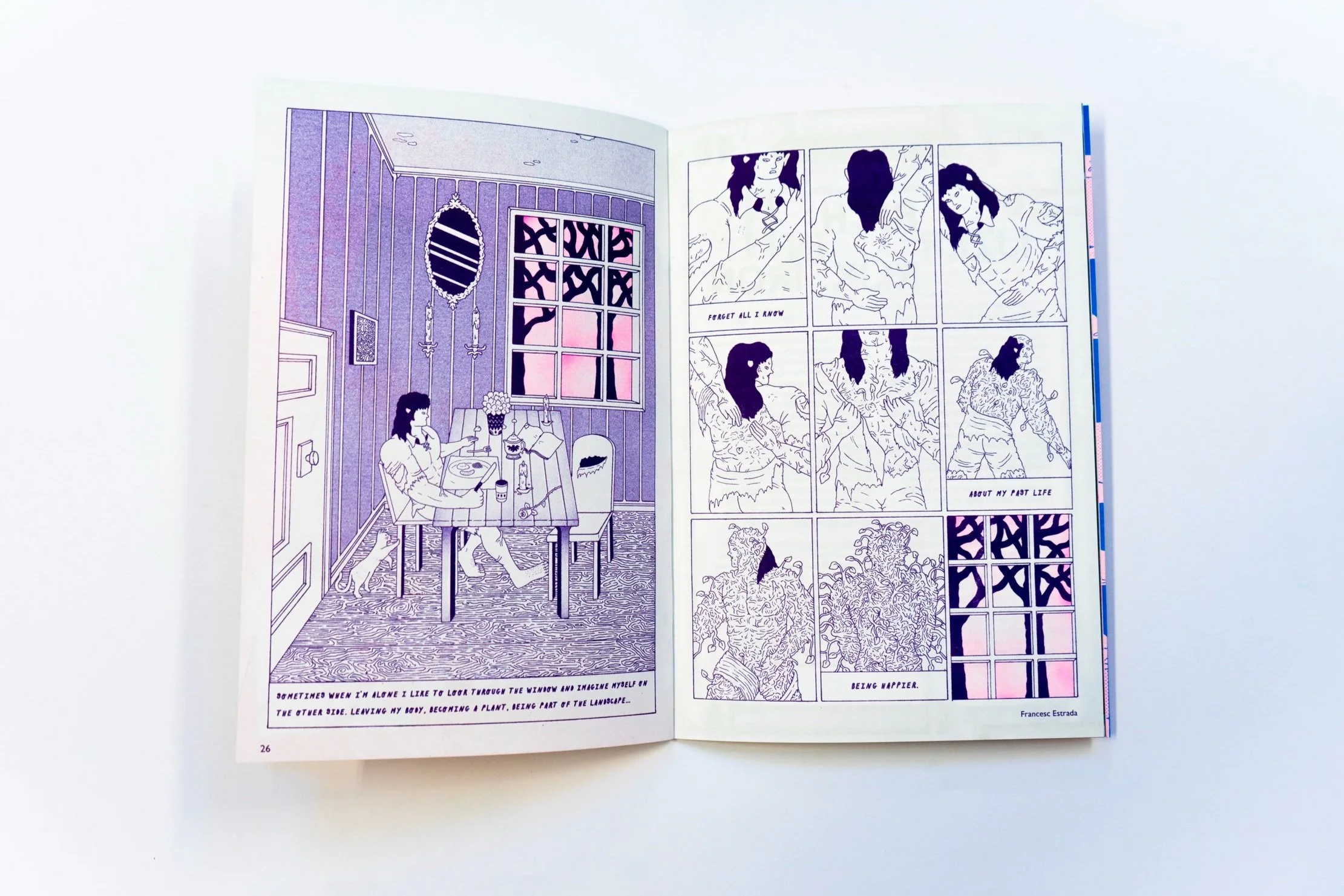
“Muscular characters in the forest, I thought that would be nice for the cover piece of Wobby. A great connection with the theme ‘Pumping Iron’. The comic spread is completely the opposite: an indoor space with a fence and window. A contradiction and reference to the cover”, states illustrator Francesc Estrada (ES). His work and that by Antoine Eckart (FR), Melek Zertal (AL/FR/US), and a host of other illustrators, are part of Wobby #29 – Pumping Iron.
Art print by Antoine Eckart for Wobby #29
“I try to produce images with my heart and honesty. I think some people are sensitive to that”, says Antoine Eckart, graphic designer, teacher, and illustrator. He made the centerfold (and poster) for Wobby #29. “This centerfold was really challenging to me because I’m not really familiar with pumping iron and with sports in general, I must confess.”
“I started with a small black and white scene with two characters carrying dumbbells. I found that interesting because it mixed strict geometric shapes with a spontaneous and more relaxed design (a style of drawing that I love to develop and explore now)”, Antoine states. “I wanted to make a more generous piece with many details, so I set out to make a fitness room without really having a mental image of what it might look like. I used bits and pieces of strength training that were floating around in my head.”
Melek Zertal for Wobby #29
Shiny surfaces
Illustrator and comic artist Melek Zertal made two spreads for this issue. She gets her inspiration from reflective surfaces, art deco and art nouveau chrome household items, and lately, with glass as well. “The process of drawing and understanding the surfaces is very intricate and I’m still trying to get the hang of the deep blacks and shiny areas. It felt good to focus on such a specific visual item for a short comic”, she states. The association she has with the theme ‘Pumping Iron’, is ‘the idea of iron pumping through the veins’. “I like the image of blood somehow turning to metal - a metallic body. Somewhere between Metropolis’ Maschinen mensch, Ghost in the Shell’s Major Kusanagi, Sorayamas robots or Mugler’s women. If there was an option to become a cold hard shell to escape your feelings, I’d probably have chosen this route a thousand years ago.”
Francesc Estrada for Wobby #29
Magic and fantasy
In Francesc’s work there is always a reference to magical and fantasy characters. “I get my inspiration from games that are from the 90s and from boardgames. For me ‘Magic: the gathering’, ‘Warhammer’ and the illustrator Ivan Bilibin are great sources of inspiration. I really like to draw different characters, so I did that for Wobby as well.”
For Antoine the inspiration comes from both graphic designing and drawing: “I feel that my graphic design studies influence me in the way I show my drawings. My drawings look free and very spontaneous but, when I work on an edition for example, I spend a lot of time editing and retouching my images, the choice of frames and the reading rhythm.”
In Melek’s work, women are always essential. “I only draw women, mostly to extirpate my characters from already set societal dynamics. A word-for-word similar dialogue will not sound the same between two women than between a man and a woman. However, I think it’s more a question for people who read my work than me; feminism is a very important aspect of my personal life, but I do not wish to make a feminism pamphlet through my work either. If it seeps through, great.”
Wobby #29 – Pumping Iron and the signed & limited edition art print are now available in our webshop.


